There are many great logos out there, some are even wonderful looking at the first glance, but only few can proudly represent all of the main and important principles of a great logo design. Why only few? It’s hard to tell, but the first answer that comes to my mind – lack of knowledge when designing a logo and it’s not just about the small or startup businesses, there are many bad examples even with worldwide known companies (press here to read about 10 Logo Fails of World Famous Companies).
Your logo is your company’s suit or outfit that you wear when first meeting your client. Let’s put it like this - what would be your clients' first impression if you came to meet them in a cheap looking t-shirt with large, inappropriate picture on it, dirty shoes and old trousers? Maybe you’re a genius in any other way and you will not lose this client, but wouldn’t you earn a stronger trust and earn it undoubtedly faster if you came to him/her in a good looking suit, clean, white shirt and elegant tie? I bet you would, because these are the first signs that you might be a reliable and confident person with a responsible attitude.

1.Simple
The best logo will always be the simplest one! Without any unnecessary details or colors. That’s the golden rule of a great logo design, because if it’s simple, it also means it will be recognizable, memorable and most likely versatile. However, simple doesn’t mean basic or generic. Let’s take the “amazon.com” logo for an example – it’s simple and also carries the message (the logo has an arrow pointing from “a” to “z”. This signifies that they sell everything from “a” to “z”. Plus the arrow also forms a smile, meaning the shopping at amazon.com can be fun). No need to say anything more! Your logo is not a painting of a scene from a bible or a long essay where you can describe each of your thoughts and write down everything you love about your business. Simplicity is the purest form of genius, as Albert Einstein once remarked.
Bad example:

2.Memorable An effective logo design must be memorable. You have maximum time of 2 seconds for your potential clients that they will spare to look at your logo and those 2 seconds will be wasted if the logo is not simple enough to stay in mind. Imagine that you’re driving in a car or fast-walking through the city (with no time to stop by) and you notice the exact product or service that you are really interested in. Can you spot the logo and read the typography from a distance? And is it simple enough so you won’t have a trouble remembering it once you’re trying to find it the next time or when searching on the Internet later back home? Memorable logo also means that your brand will take a place in people’s memory much faster than the one that can be barely remembered.
The given example (“Chanel” – the two chained “C” letters from the initials of the famous fashion designer Coco Chanel) can be recognized by most people because it’s already worldwide known, but I would like to believe that no one would ever have a hard time to remember this logo just by looking at it for a second.
Bad example:

3.Versatile
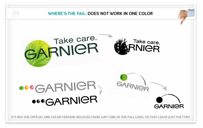
The logo must work in one color! Of course the one color version most probably will differ a bit from the one that’s meant for a web or print, but it still has to be as recognizable and effective with NO changes of structure, lines, silhouette and composition, so that there’s just the color taken off and nothing else. Otherwise you will have not one, but tons of logo versions, each for the specific needs or you’ll just have to get rid of your logo and use a simple text of your company’s name. So it’s smart and vital to have a one color working logo already at the startup of your business, even if it’s just a small website at the beginning, so you won’t have any limitations on its usage and your marketing ideas in the future.
Few examples, where one color can be the only available option:
• embroidery on your company’s t-shirts or any other clothing (few color version also works)
• engraving on a metal plate at your office doors, promotional products, leather covers for notebooks, pens, document cases, etc.
• fast print situations - when emailing or faxing someone, your text or document most probably will be printed just in black. Even if it's a quality b&w, your logo can become impossible to understand after a few copies, so it's much better to use a one color logo version when faxing or mailing any regular documents.
• environmental laws – there are so many places around the world (almost in every city) that does not allow you to use your logo in a color version. Imagine any historical street with old buildings and beautiful architecture – how would it look like if there were no such rules? I guess something like the center of Hong Kong :) I have nothing against this city, but it’s not appropriate for all the cities and places, so you must be prepared for with it.
• other situations - there are lots of other examples, so feel free to add your own thoughts or experience in the comment section below!
If the logo has gradients, shadows or any other effects, it should also be able to work not just in one color but in a few - two, three, maybe four, it depends on the actual color tone count of it, but a good logo shouldn’t have more than 3 colors, with some exceptions (that it’s still simple and memorable).
Also one more important thing – the logo must work in any size and place, so it can be readable and understandable both in large and small sizes, so older people wouldn’t need to look for their glasses and the logo keeps its form and silhouette when resized. So this is the point where to say - always choose function over innovation.
Bad example:
4.Timeless 
The most famous example of timeless logo (above). Did you know that the Coca Cola logo design from 1940 is almost no different from the one that we see today? While Pepsi has completely changed its design for at least 10 times. Imagine the unnecessary money and energy spent on these redesigns + all the time that was needed to get back the product in its previous position and recognition. You can see the example below:
 Who saved the money, time and energy that could have been used in any other way if the logo was made timeless? By the way the newest Pepsi logo redesign costed $1 million.
5.Appropriate The logo must represent your company’s purpose, values and products or services in some way, not even directly. With that said it doesn’t mean it must be a basketball ball for a sports company or a roosted chicken for a fast-food restaurant. Let’s take the “Nike” logo for an example - the logo represents the wing of the Greek Winged Goddess of Victory called Nike. She is the goddess of strength, speed, and victory. The stylized wing represents all of these three values. Plus it’s also a checkmark - the sign of a positive mark and good results.
Bad example:

6.Unique
This is not an obligation, but if we are talking about an EFFECTIVE logo, it also must be unique in some way. Of course there are many large and worldwide known companies, that can’t be proud of some originality in their logo, unique details, hidden messages, etc., but a large company doesn’t always mean it’s something worth to learn from. Unique means your logo will be original and powerful enough to proudly rise amongst others and your competitors. Unique doesn't always mean hidden messages, negative spaces, interesting details or secret anagrams (which is all great and remarkable) - your logo can become unique even if you just tilt it up by 45° degrees and leave it as your standard horizontal logo version. If your logo carries something special, there’s more chance of getting noticed instead of getting mixed together in a large and similar mass of brands.
Bad example:
 CONCLUSION: I always say – a good logo design most often is the one that can be repeated from a mind with a pen on the corner of a notebook by anyone. Why? Because if someone can do that, it means this logo is SIMPLE, MEMORABLE and it works in ONE COLOR (that means this logo can be used with no limitations on a variety of media, embroideries, engravings etc.). Plus if someone ever had this idea to redraw a company’s logo on his own notebook, well… it’s probably an effective one :) But as mentioned above – it also must be TIMELESS, APPROPRIATE and very recommended – UNIQUE in some way. Thank you for reading! :)
Author: Linards Lacis, UrbanPicture.net – Logo designer, Web designer,Graphic artist